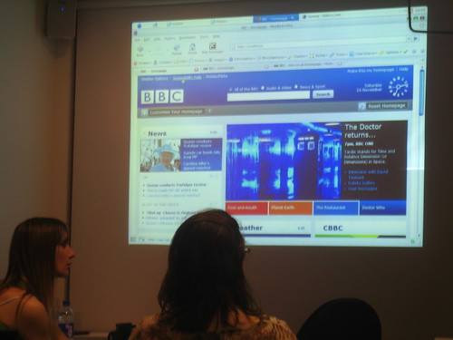
I saw this first via Adactio's flickr feed into my netvibes (how web2.0 is THAT!) and it's generating the most interesting discussion. Adactio is Jeremy Kieth, a prety well now web designer and engineer, who also happens to live in Brighton. As do I. But I've only met him a couple of times and both at work in London.
Anyway, one thing I've picked up is that you can't tell much abut a web page from a screen shot- I've been playing with the beta for a few days now, and the key thinks that I'm bumping my shins on are nothing to do with the look and feel as you can see in a screen shot, but much more around the way it works- the functionality, the responses to imput etc. I'll be honest, it ain't there yet! Lot's of the simple relationships between elements are slightly off kilter- instructions are laid out differently to the things they control, bits aren't as configurable as you might have expected from their presentation, or from what yu can do elsewhere on the web. Don't get me wrong- it's good and a better representation of ALL the BBC than the previous home page was and includes great features that are a real advance. However, within its limits, that 'glass wall' design felt perhaps more cogent and complete. Enjoy while you can: http://www.bbc.co.uk/
p.s. Apologies for te typos- laptop has lost backspace and it'll be 2 weeks for a replacement (bloody outsourced IT!)
This is the blog of Ant Miller, senior research manager and dilettante geek at large at the BBC.
I wail moan and cuss about the challenges and fun to be found here.
These are my personal opinions, and not those of my employer. Or anyone else here for that matter.
I wail moan and cuss about the challenges and fun to be found here.
These are my personal opinions, and not those of my employer. Or anyone else here for that matter.
Monday, December 03, 2007
The new BBC homepage
Subscribe to:
Post Comments (Atom)

2 comments:
Have you sent comments to the homepage team? It's not too late!
Left loads- hopefully taken as constructive!
Post a Comment