On the other hand, when a designer cocks up, they just spread misery. I have recently taken delivery of a new work laptop (another one! yes damnit, I have several laptops, but the aim with this one was to get something small and powerful enough to avoid carting two around (as I have been for months)). So I got what Siemens (don't ask) currently issue to us here at the BBC, and it is this-
The HP Elitebook 2530p.

Sweet looking thing isn't it? I got 3gig of ram and a bigger battery too, and in essential regards it has all the chops I need- good battery life, tough, lightweight, grunty and can draw pictures (driving large monitors is something it gets asked to do a lot, and transcoding video too).
It is however a cluster of niggles. As my darling wife is all too weary of hearing- 'it does annoy'.
Annoyance 1. The little light.
This was, initially, a delight. A little design touch that really pleased.? When one presses the little button next to the webcam, a tiny light pops out and illuminates the keyboard to enable hunt&peck fun in the dark. How sweet! How useful! What an utterly bloody stupid way to solve that problem, and a wasted opportunity at that!

I have big hands. Approximately how many keys are visible when I am poised to hunt and peck? Eleven- rtyu, ghj, and vbnm. Why?- BECAUSE I DON'T HAVE GLASS HANDS! There is an excellent reason why backlit keyboards are considered 'really good ideas'- they light the keys, not the fat fivesomes of sausages that waft above the keys. I don't much care to see the back of my hands at night; I do want to see the keys, SO LIGHT THE BLOODY KEYS!
Then, they take this tiny but remarkably bright light, that routinely proves its worth in illuminating human flesh, and don't think to give the hinge it's on another 70 degrees of rotation so that it could also serve to light the face of the user when using the web cam. Because that's never a problem!?!?! Why why why!? This is so obviously an element that has had some design thought go into it- how on earth could it have ended up producing such a powerfully unfulfilling experience I HATE THE LITTLE LIGHT! It promised so much, it does so little, and what it does is rubbish. But because it's such a cute idea, I always use it and it always drives me up the bloody wall! Argh! Driving me mad!
Annoyance 2. The scratch resistant lid.
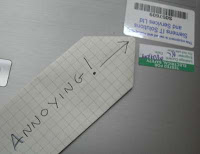
Mmm, shiny metal, mmm, brushed alloy, nice. I might hold off stickering you cos your so purdy. Oh damn, Siemens have already stickered you (philistines!).

Ah well , I'll keep you safe and purdy, slip into my bag and then... WHAT THE?!*&&?>

This is by no means a scratch resistant- it is rather a foil soft canvas, a field upon which to pirouette creatively, and leave ones mark. For you see these scratches were made by laying the powerbrick upon the surface- THE POWER BRICK- as if that would never go near the casing!?!
Annoyance 3. The power brick.
Which is just shit. Not bad, not wrong, not lethal. In it's defence it's small, unassuming subtle, but quite clearly nobody at HP has so much as looked at this non-entity since forever- and the result is undesign. The result is annoying tangles of wire, scratched lappy lids (see above, about which I AM STILL FUMING!), and a good three minutes of grief every time one unpacks to set up. Why HP? Why do you not realise what a tedious ball ache you are foisting on us? I unpack the laptop twice a day, maybe six days a week. For five minutes a day, half an hour a week, one whole solid day a year I faff with your utterly apathetic approach to power supplies. It's a thing I buy from you- BLOODY DESIGN IT YOU LAZY SODS! Oh, I'm sorry, was this feeble flap of Velcro your idea of a design for managing cables? Hmm? WRONG!
Annoyance 4. The nipple.
Why?? I mean really, the nipple is rubbish- always was. As soon as the track pad came along we all breathed a huge sigh of relief, uncramped our hands and got on with life. And this isn't even a good one. So why? It's just pathetic. Drop it.
Annoyance 5. The trackpad.
Oh, maybe this is why: You can't design track pads can you? You've properly stuffed this one up. Those buttons need a bar between them and the pad, especially if you dome their backs otherwise.... oh, yes this happens. Hard to explain in text, but basically whenever you touch a trackpad button, the pointer jumps 2 inches up or down, because your thumb brushes the pad, creating a second contact and stuffing up the pointer. So now it takes twice as long to move anything, and I routinely misfile emails and folders. You pillocks- it's not like this is the first laptop with a pad- did you not SEE that every other pad has a safety bar? DID YOU NOT TEST!?!

Annoyance 6. the '1' key.
Ok just a little one this, but it's smaller than all the other keys. Why? I know the number is smaller- I don't need to be reminded. Did you just run out of space? What? It doesn't actually matter- it doesn't affect the usage of the keyboard (which is, in all honesty, very mediocre- the Dell XPS m1330 I'm moving off has a far nicer keyboard) but it does look shit. I mean really really compromised and nasty and shit. And like you don't care.

Annoyance 7. The lid latch.
Is this really the best you can do- after decades of designing laptops- a round peg?? With an all around latch grove?? Which only latches on one side?? That sticks out of the lid ALL the time?? and doesn't even latch shut properly 1 time in 5?? It fits the pattern, I'll give you that- the half-baked awfulness of it. It's actually quite well made too- just a really really rubbish idea that doesn't work.
Annoyance 8. The volume control.
Ok, you're not the only ones to get this wrong- touch sensitive buttons for specific functions on a laptop are a pet hate of mine, and everybody does it. The only laptop I have with a decent volume control is the Alienware Aurora M9700 (an incredible beast- I can't actually carry it any distance without damaging myself though) which has a little dial- a physical rheostat or some such, actually controlling the volume of the output amp. It's brilliant. I can turn it down before I turn it on, and it works with any and all software and isn't slowed by software multithreading. HP, your solution sucks.

Your slider thing has an AWFUL mode of interaction- it took me ages to figure out I have to slide my finger along, and no two slides have the same effect. Volume control is trial and error- deafening error- every time. For the record- the Dell also has shitty touch sensitive volume buttons and the Alienware had some other functions with the same type of button, which I had to deactivate. People- touch sensitive is rubbish. And we all know you put them on because they are cheap. Stop being so obviously cheap. It's nasty. And that is HP's shtick.
In conclusion then, this is a good laptop wrapped in a shell of unfeasibly annoying design disasters, and drags down HP's reputation every time I look at it. I'll soldier on with it- I have to, and if truth be told it is good enough in many many ways, but it will gnaw at my soul every day. If I go postal, you'll all know why!
This is why I don't begrudge the premium I paid for my 13" unibody MacBook. Alright, I'd really prefer a matte to the glossy screen, but that's my only quibble.
ReplyDeleteThink of all the productive things you could have been doing instead of spending your Sunday evening spouting vitriol at technology... making me a cup of tea, massaging my feet, running the hoover round, playing Lego...
ReplyDelete